HP Sprocket App | Background
The Product
The HP Sprocket is a portable printer that allows the user to print straight from their phone using a bluetooth connection. The printer prints out adorable 2“x3” photos that can be placed anywhere the user desires. The small photos even have a sticky-back if peeled—making them stickers! In order to use the printer, the user must have the HP Sprocket app.
The App
I came onto the Sprocket App team just after a 2.0 update. As I learned about the app, considered our audience & competitors, I noticed that the app needed an update. The app visually needed to appeal more towards our target audience; which is primarily females ages 14-24. Additionaly, the interaction and overall experience could be greatly improved.
I worked closely with the lead IX designer and lead UX designer. At the beginning of the project, we all had a similar vision to update the app—to transition the style to be lighter visually and improve the interaction/user experience. I then started the process of updating the design; to appeal more towards our audience by being friendly and welcoming.
Recommendation: Jay Myers
Lead UI Interaction Designer at HP
I have worked with Melissa for nearly two years. As the lead designer on our team, I was able to rely on her understanding of interaction and visual design. Melissa is an excellent talent who has helped our team to redefine the look and feel of our app to better suit our primary target. She helped guide other team members to grow their understanding of design, illustration, and color better. Her interaction with the team lifted them toward their best and the whole team benefited from it. Her eye for detail and understanding of the design goals helped our app to rise from a 2+ rating to a 4+ rating in both the App Store and the Play Store. To that point, she is very knowledgeable in designing for iOS and Android (in an Agile Process) and understands when to utilize the strengths of both and when to create parity of design between them. Definitely, if the opportunity arose I would work with her again.
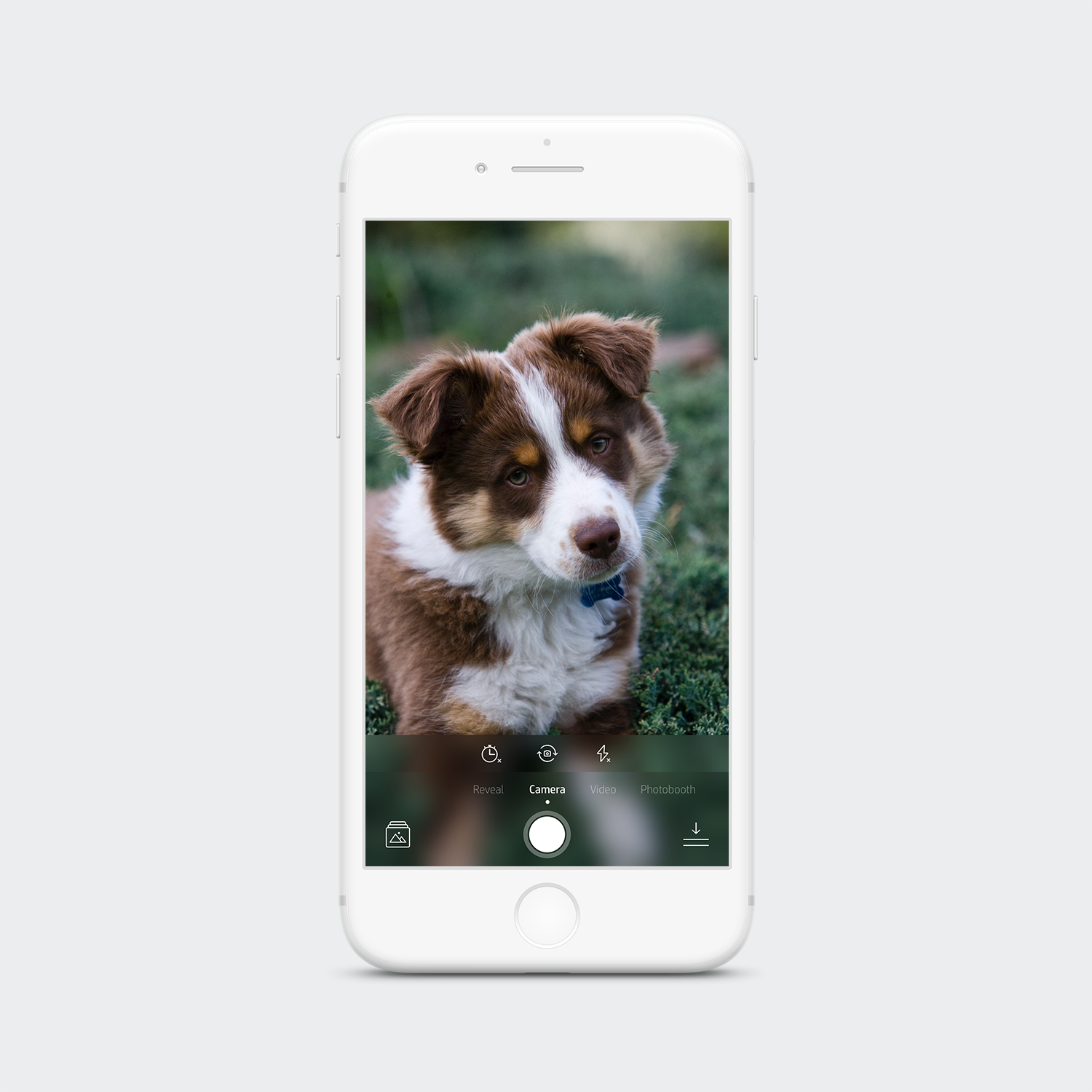
Camera | Original Design
This was the original design for the camera experience. Seeing this, we first wanted to update the camera and start moving our navigation towards the bottom. Since phones are getting quite large these days, it helps having the navigation and flow revolved around where the user’s thumbs will be. Our users were also getting confused on how to scan photos to reveal magical content, & how to use the photo booth feature. As you can see below; everything is hidden and could confuse a user.
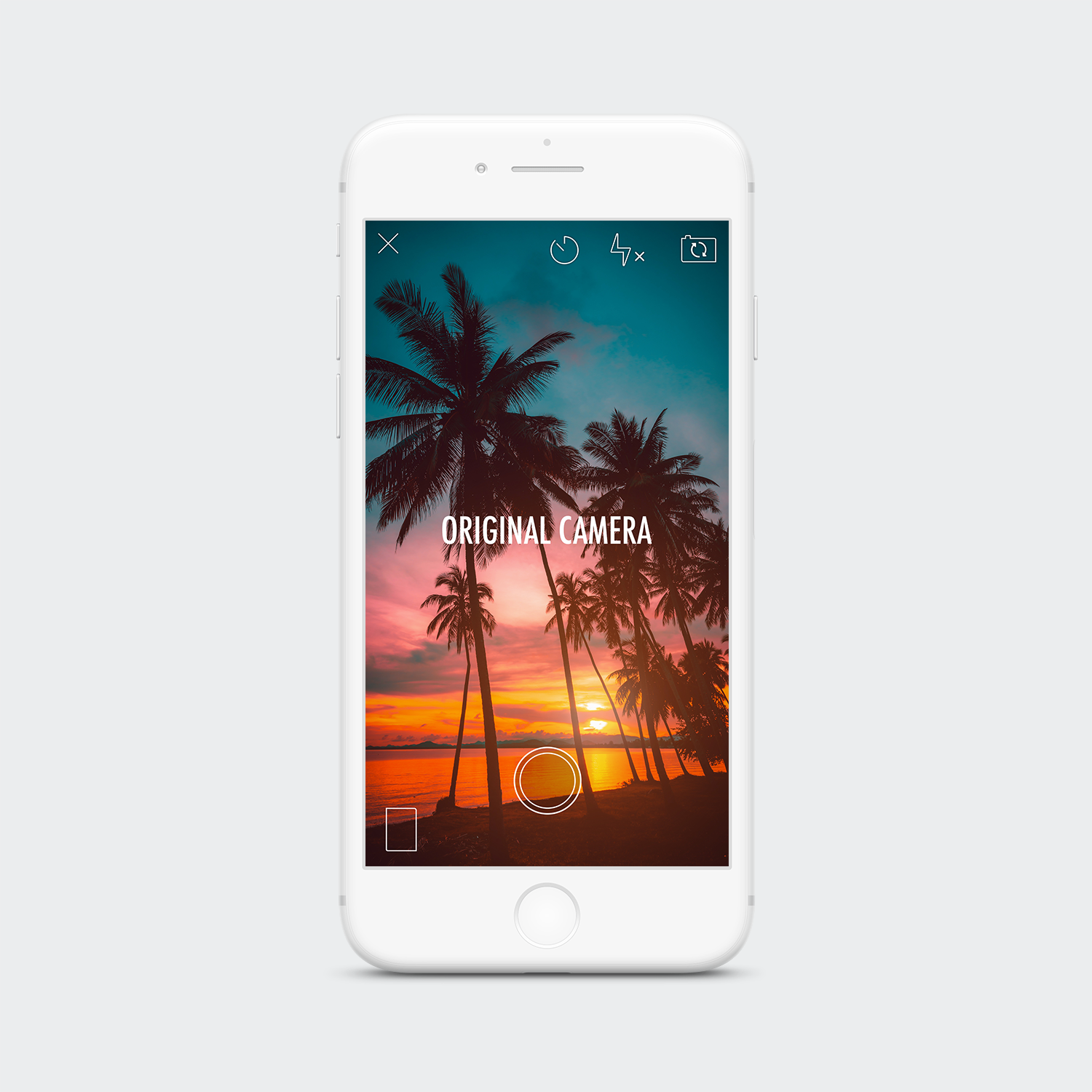
Before the camera was not intuitive. Video: press & hold the camera button to initiate video. Reveal: hover camera over a photo to scan. Photo Booth: tap square “Photo Booth” icon in the left corner. Our users were confused, and so was I!
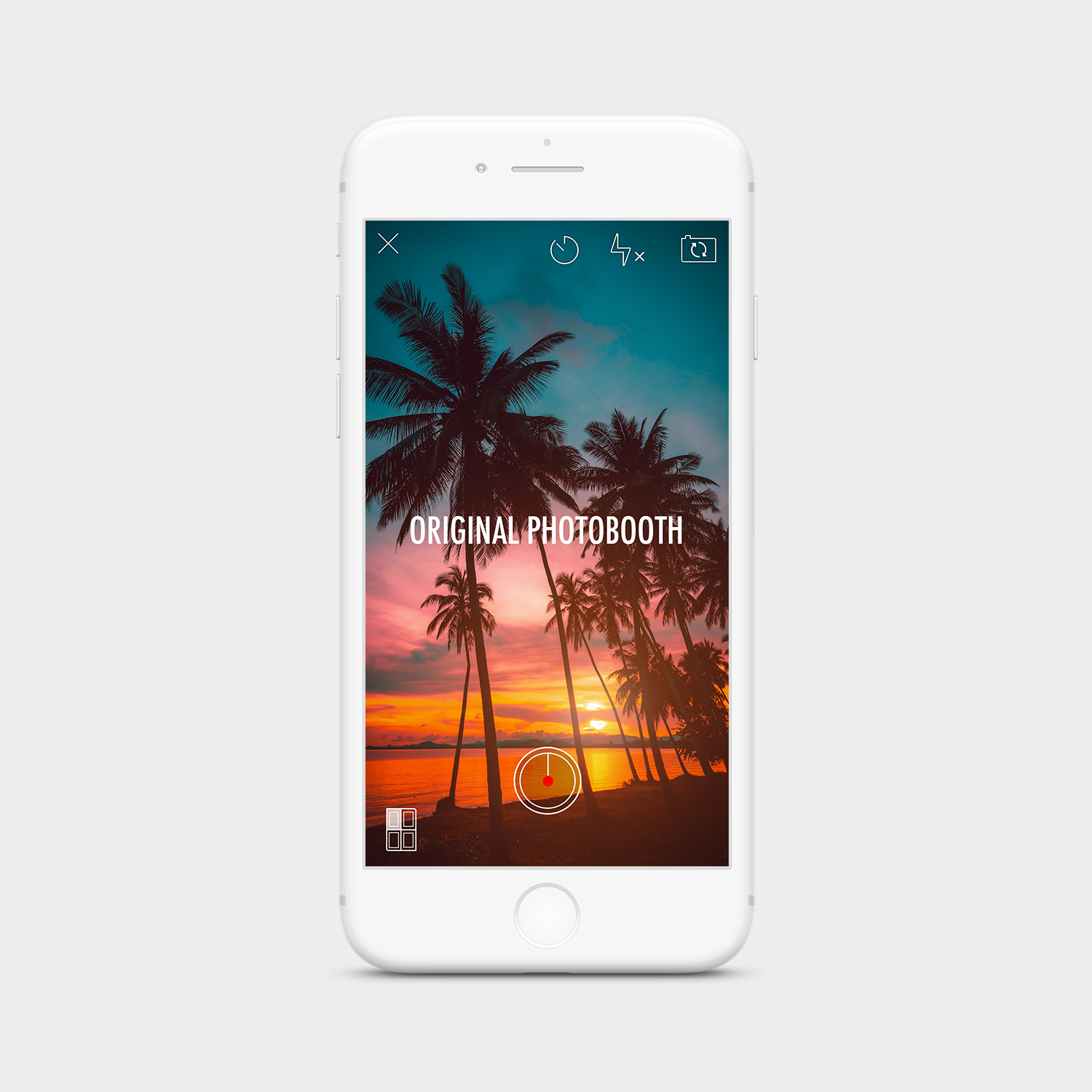
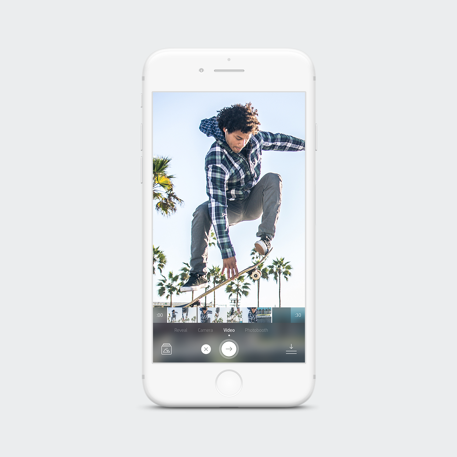
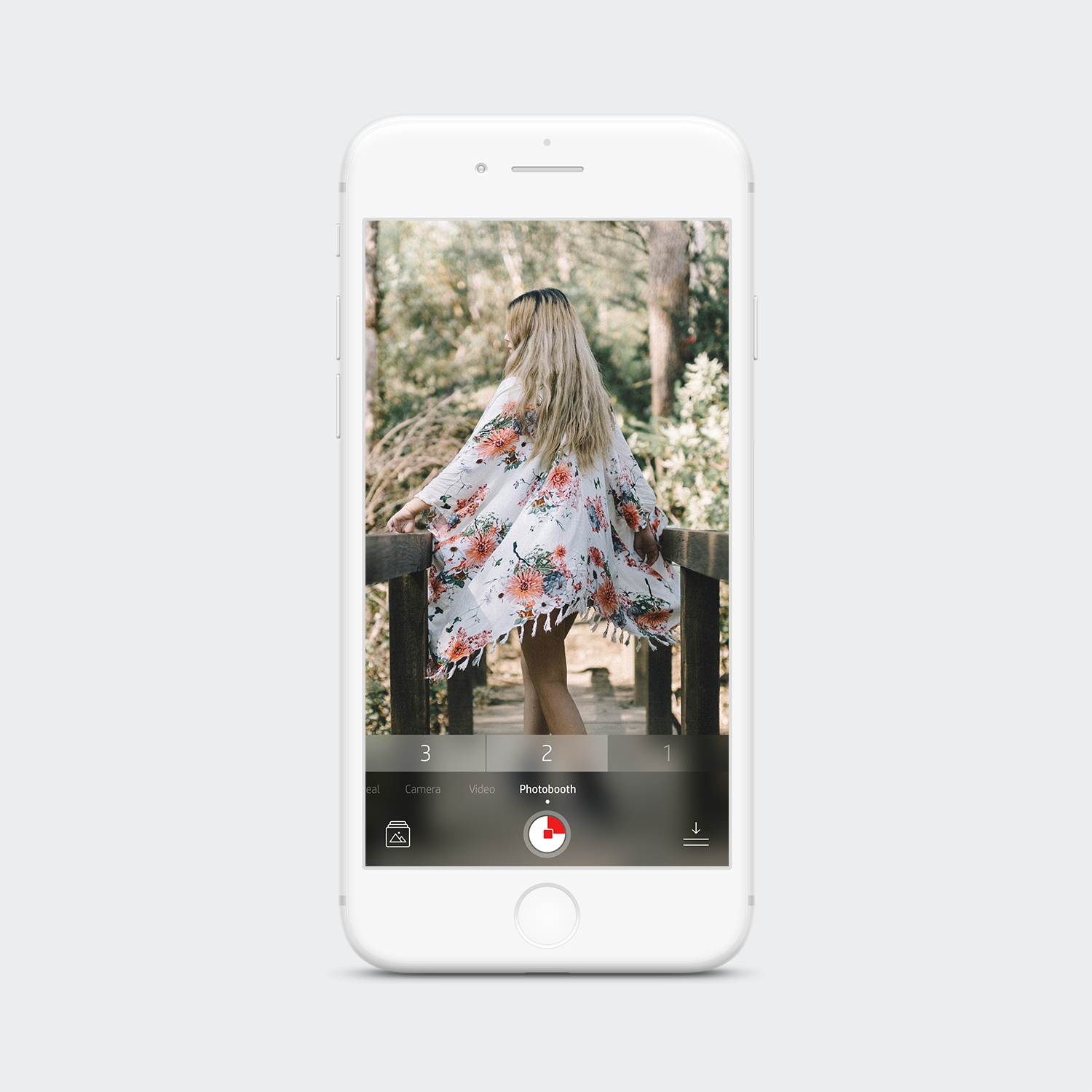
Camera | Updated Design
Now with the updated camera, everything is surfaced to help the user better navigate at a glance, verses searching and taking time to explore. Icons have been updated to be slightly more friendly, but still being in the stroke style. Navigation has been added; Gallery & Print Queue.
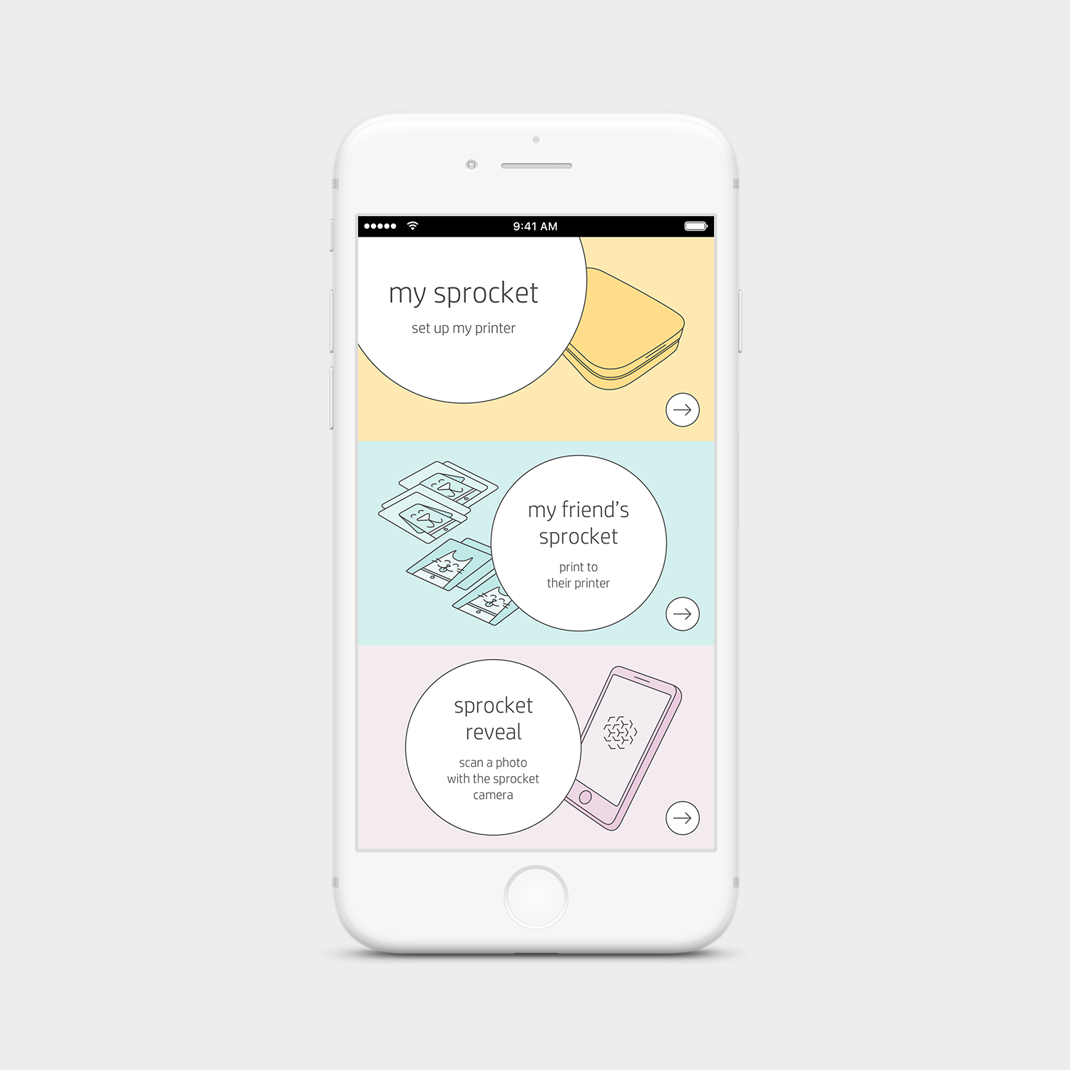
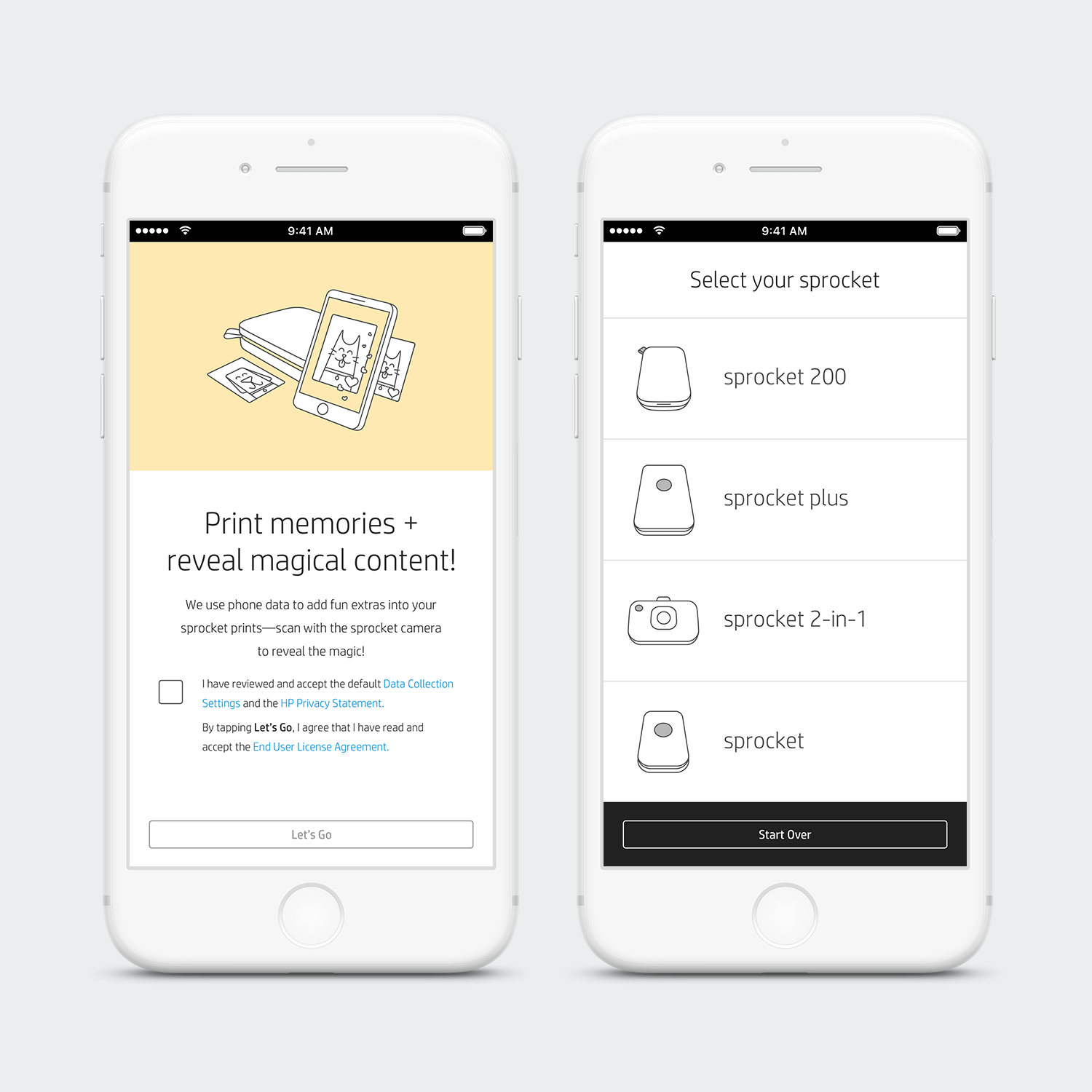
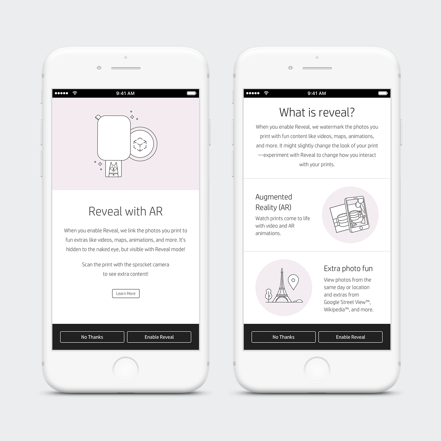
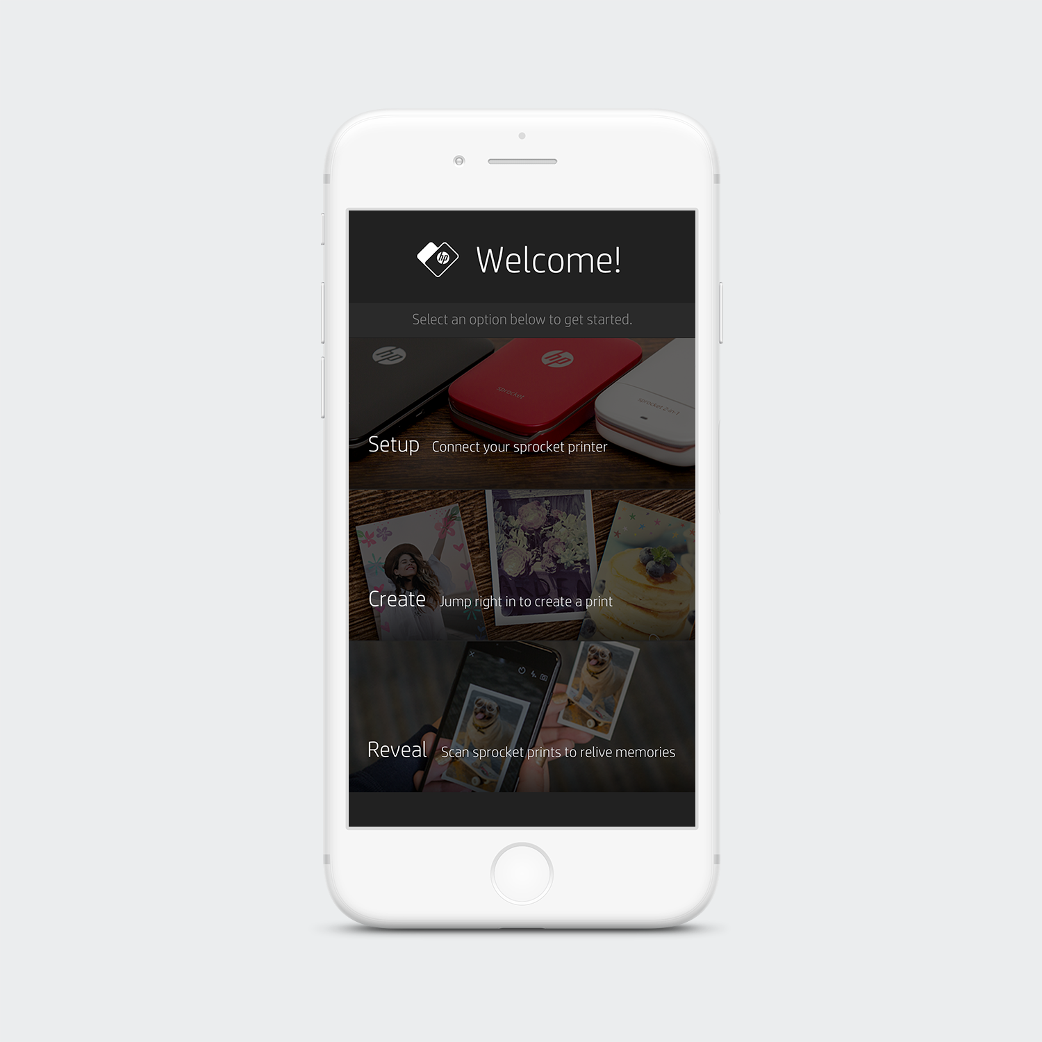
Onboarding | Original Design
Below are the previous Onboarding screens we had before I came on the team. We wanted to update the design; friendly, fun, and move the photography towards illustrations. Updating this section to have illustrations would allow the user’s content to be the star.
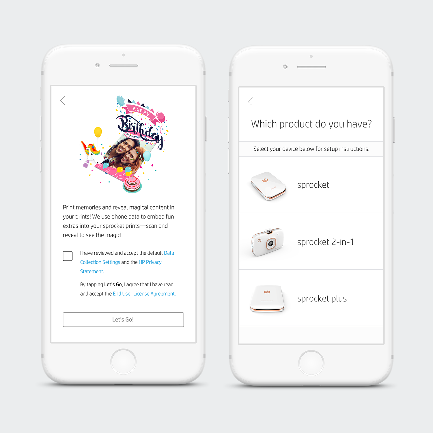
Camera | Updated Design
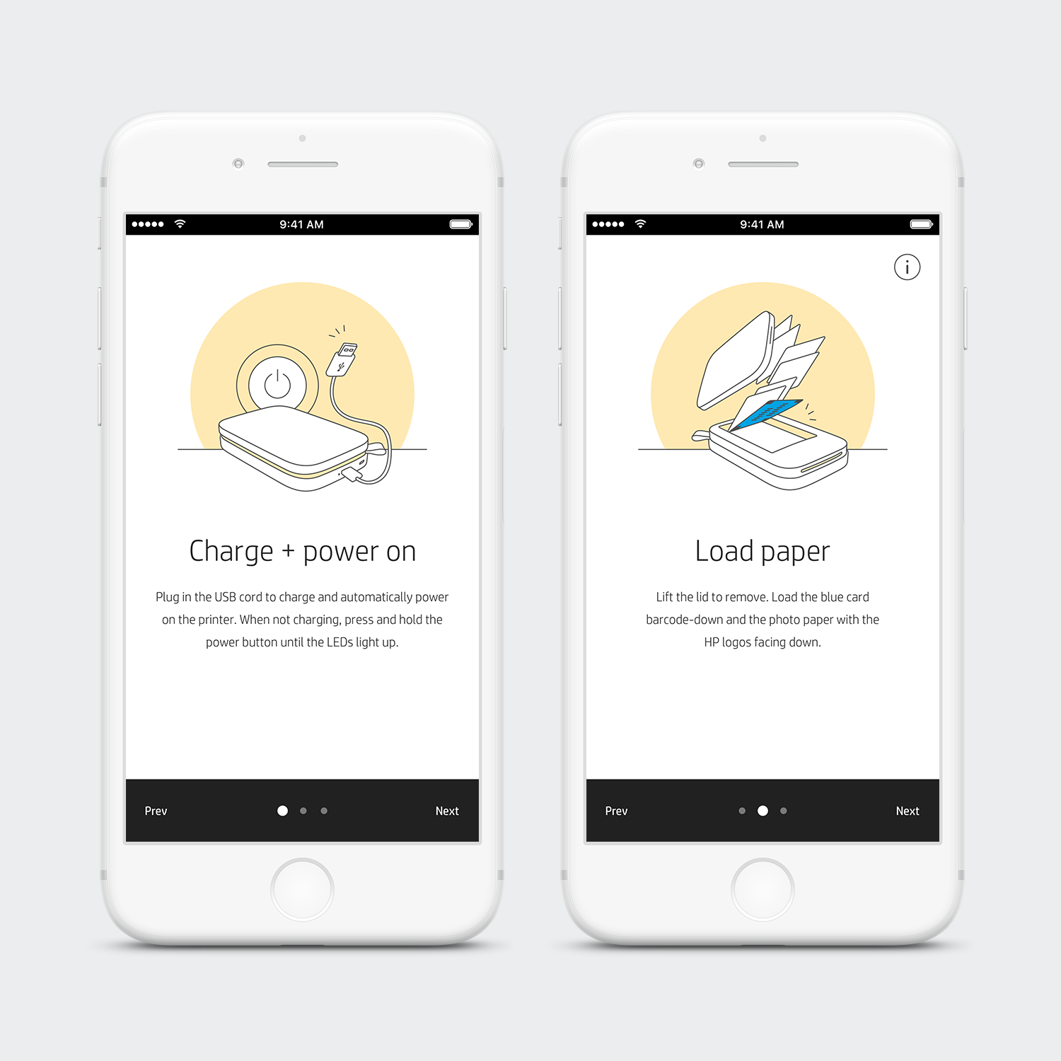
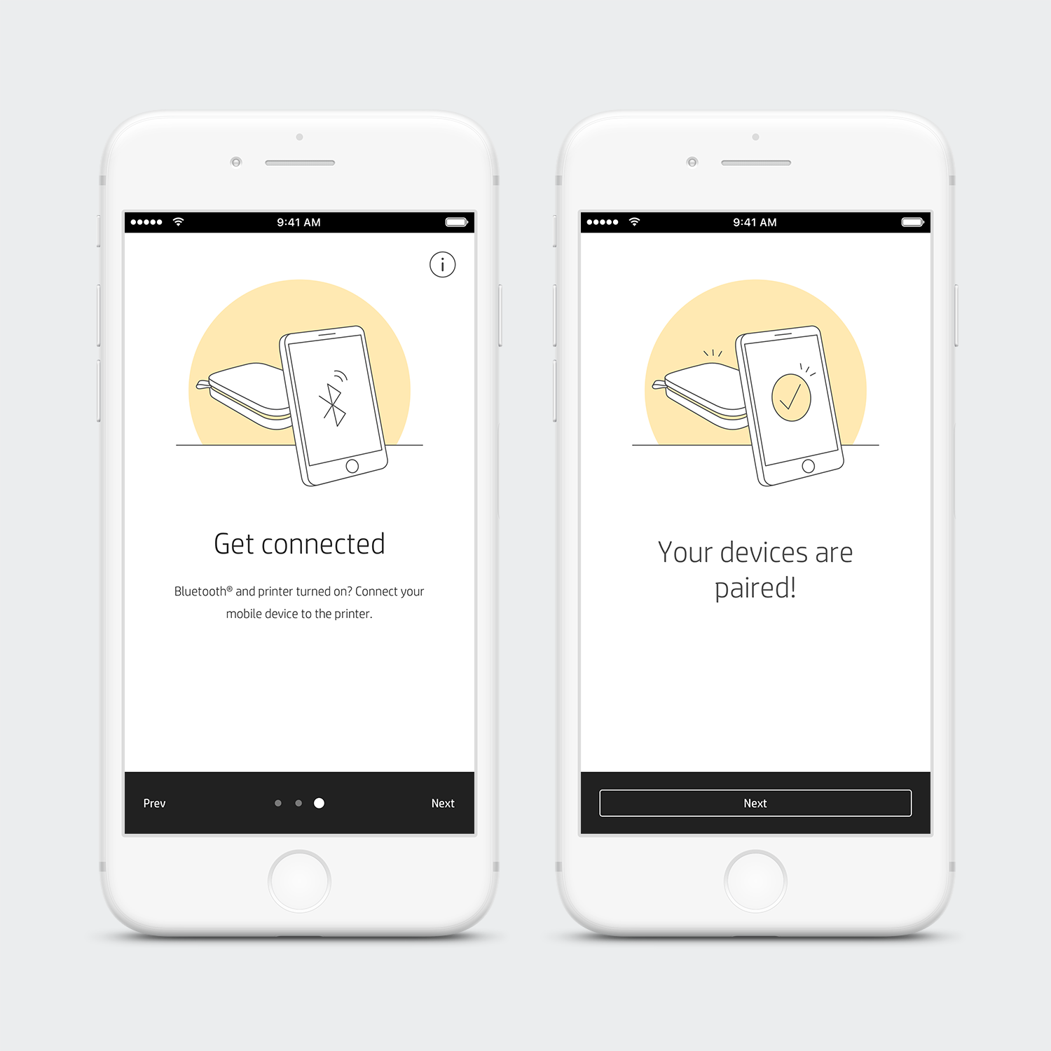
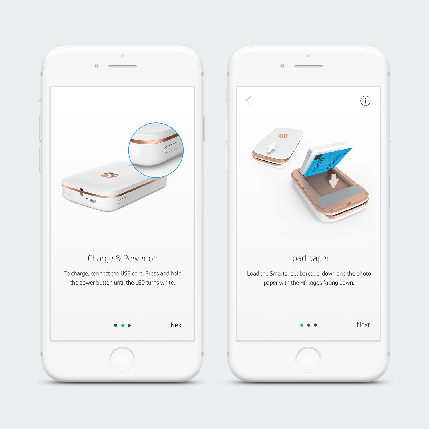
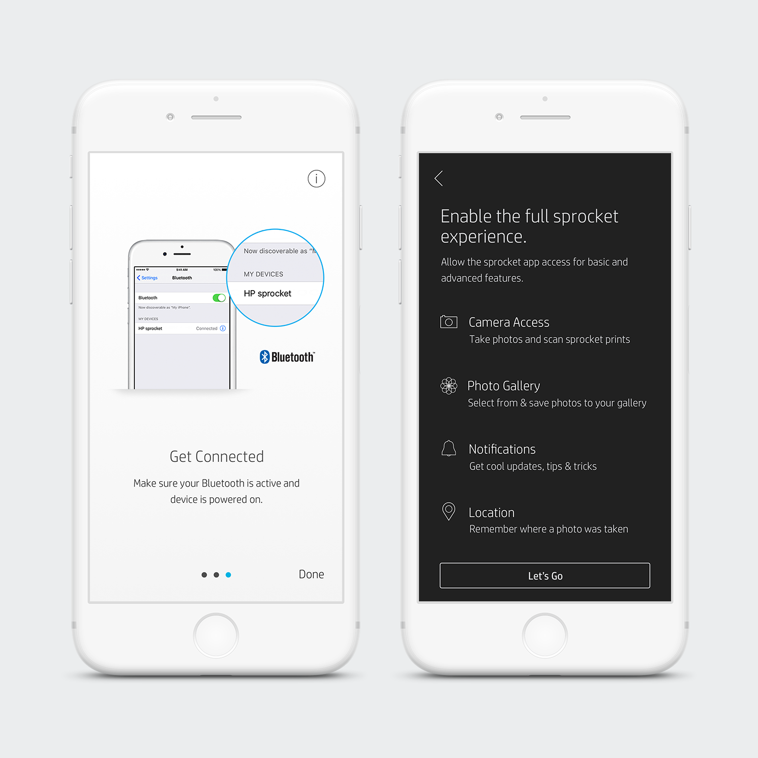
With the update I introduced new colors. These colors separate the different paths that can be taken by the user. Whichever path the user goes down, the screens continue to have that same color pattern. The one shown below is the most common path taken; setting up your printer.
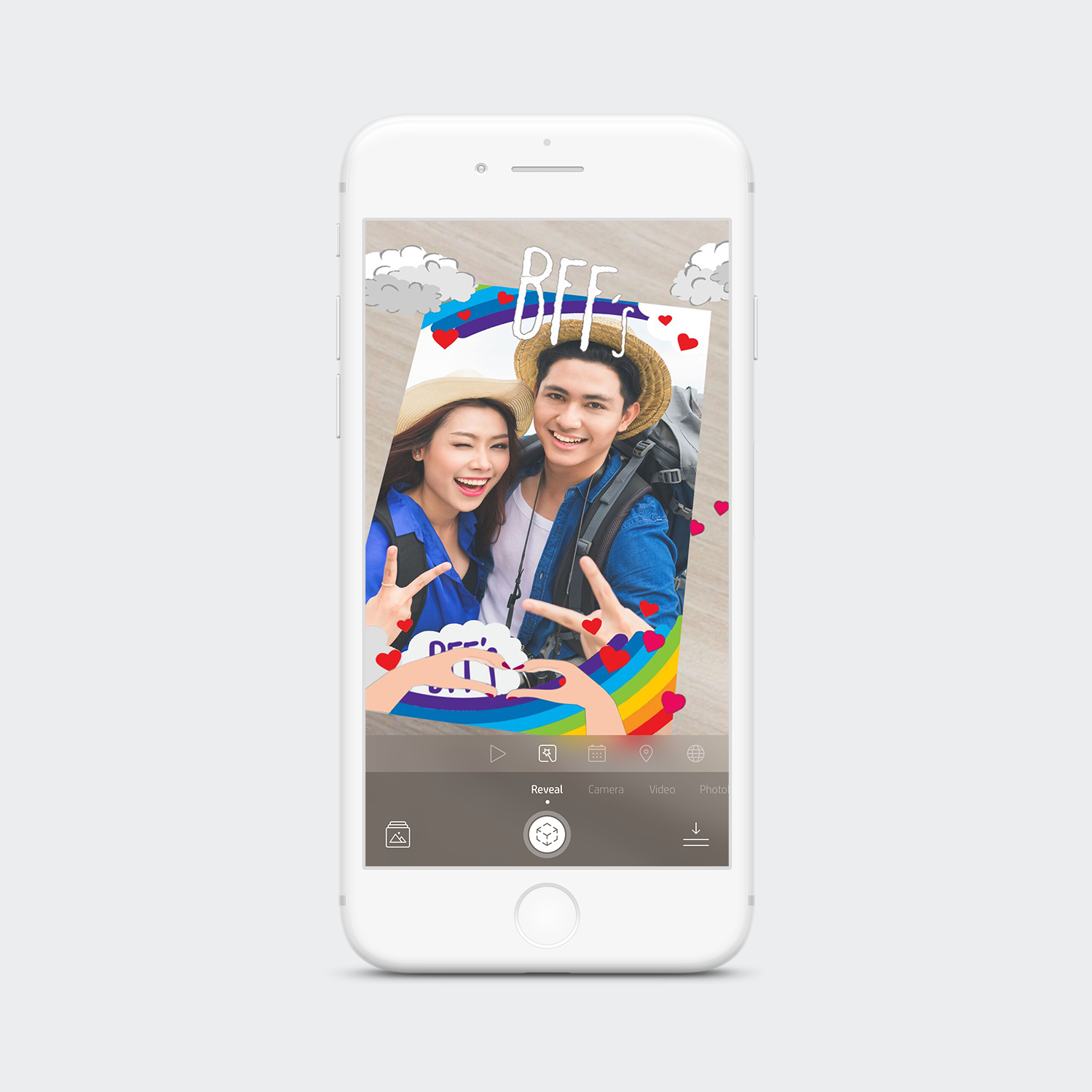
Additionally, a Reveal section was added at the end of the path—this section helps communicate what Reveal is and how to enable the feature.
The photos have been updated to illustrations. I wanted the illustration style to match our icons. The update was successful, as users responded well to the fun illustrations.